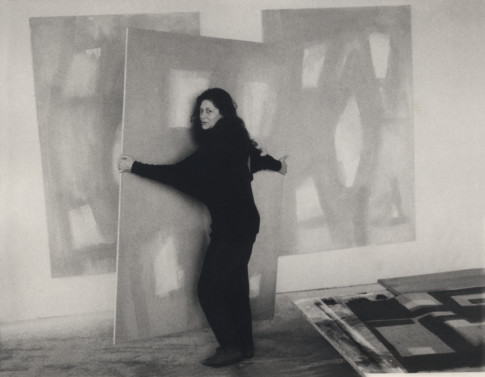
Beate Wassermann in her studio Photo: Private
About the works in “Beate Wassermann – Balancing Acts”
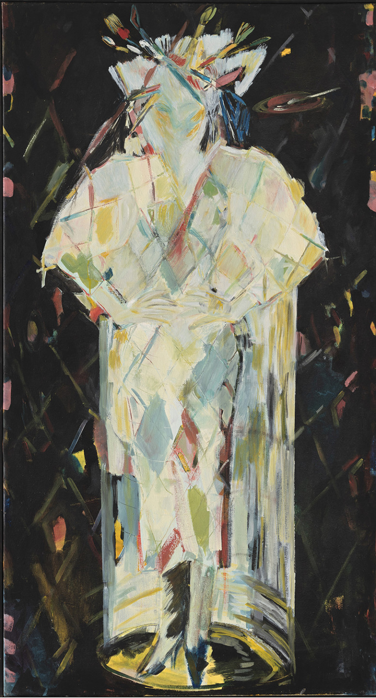
Madonna from Altona (Madonna von Altona, 1979)
One of Wassermann’s rare self-portraits. She was active during a period when it was hard for women to get public recognition as artists. In this work, the artist explores her different roles as a woman, an artist and an expecting mother. Wasserman is standing in a beam of light in pointed pumps with paintbrushes in her hair like a crown of thorns and highly pregnant. She portrays herself here as a mixture of harlequin and martyr. Altona was the Hamburg neighbourhood where the artist lived and worked.
This painting was very important to Wassermann, reflecting womens situation as artists.
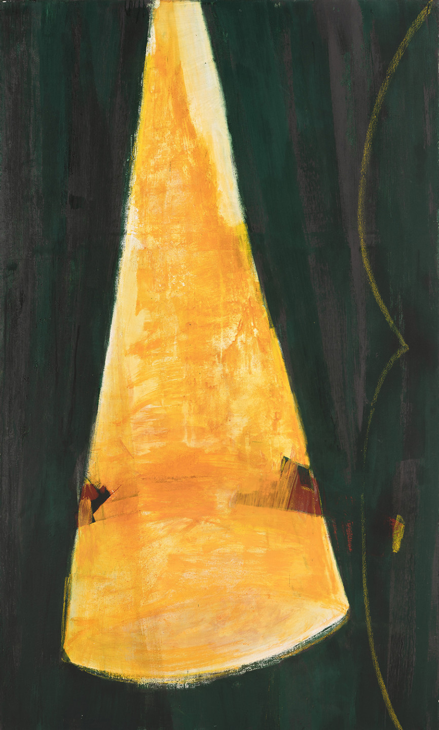
No title (O.T, 1990)
From the 1980s and onwards, Beate Wassermann continued to condense her forms into large signs. Her works moved towards increasing abstraction, and the removal of anything inessential. Often in a narrow standing format with strong colours, these works have a monumental quality. They lead our gaze upwards and are distinctly physical. The artist’s interest in the materiality of colour is manifest. Her paints are mixed in the studio with pigment and binder, often egg.
The works feature overlapping circle segments, like an embrace, and triangular shapes forming a structure that seeks its balance. Light and darkness, contrasting in the great beam of light, is a theme she explored extensively in the years to come.
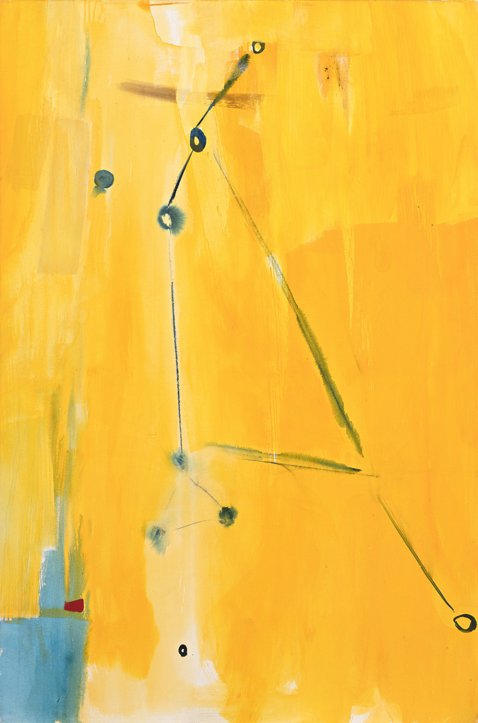
Constellation IV (Sternbild IV, 1996)
Her first constellations are from 1993–94. Inspired by postcards from the Hamburg Planetarium, these paintings are based on different zodiac signs, chosen according to people who were close to her. The paintings represent a playful dialogue between mankind and a greater, cosmic context. But these constellations also led to an even freer approach to painting. In variations on the theme, the artist has further reduced and simplified the stars into holes in the blue sky, or windows opening towards infinite space.
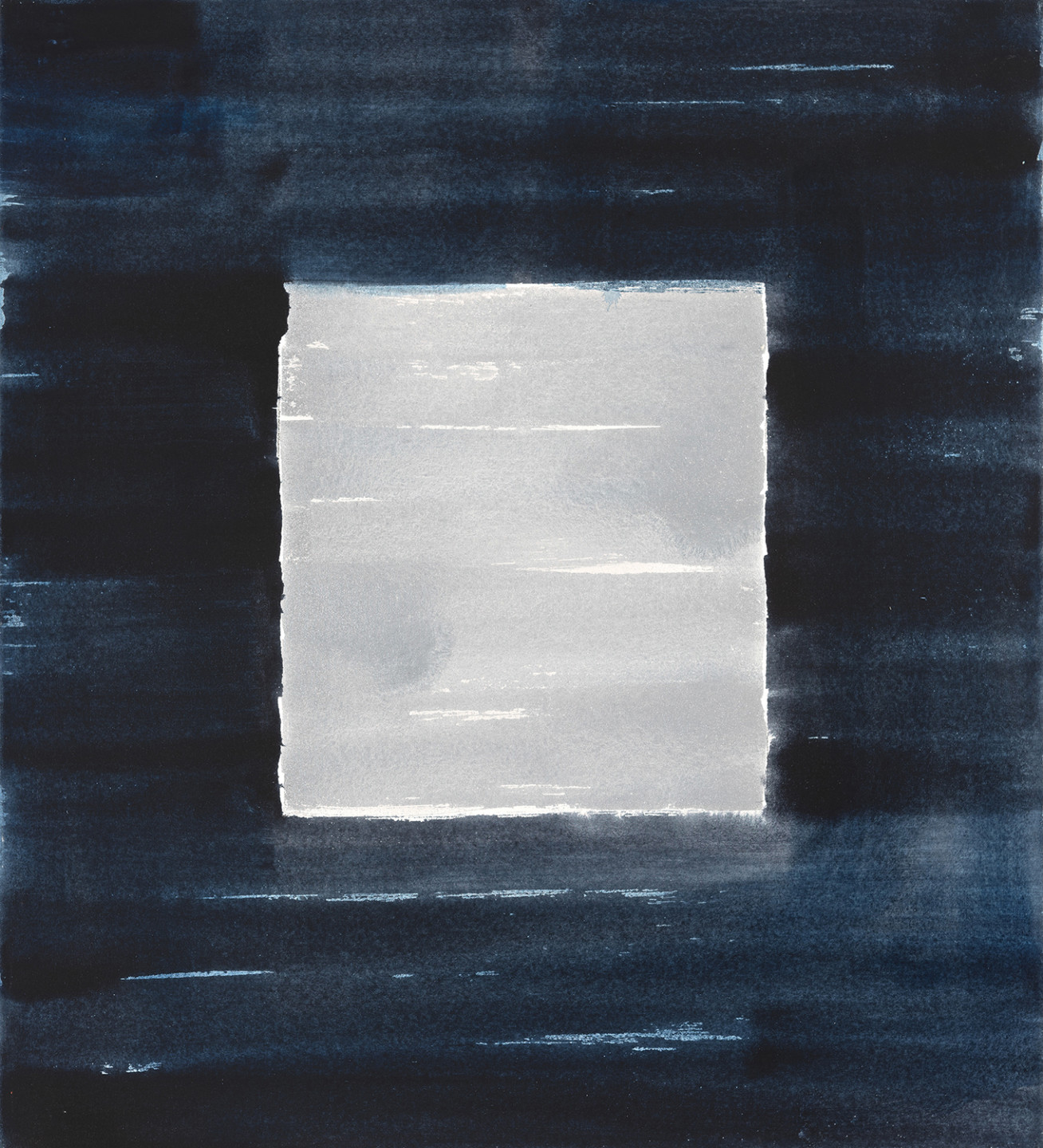
So called square (Sogenannte Quadrate, 1994– 1997)
In these works, made in 1994–1997, the square, silvery middle section gives the illusion of an opening to the light, like a window. Silver fields are a recurring element in Wassermann’s works, recalling the thin foil chocolate wrappers of her childhood but also other found objects, such as Asian ritual rice paper sheets. A further reduction of the pictorial surface is seen here where the interplay of light and darkness is balanced in the painting.
From the cycle Balance (Aus dem Zyklus Balance, 1997)
When does balance become imbalanced? In these works, the artist explores various balancing acts, in a gradually more and more freed way of painting; balancing shapes and colours, heaviness and lightness, colour fields in relation to the brushwork direction. Wassermann’s way of painting is very physical. The images are a mental and physical field of dialogue. The lines are drawn in highest concentration and presence, relating directly to the artist’s body. The length of her arm determines the size of the circle segments.
The acrylic on cotton canvas creates an appearance similar to watercolour, giving a clarity and at the same time an ephemeral feel to the paintings. This balance is precarious. The works in this cycle are powerful yet finely-tuned balancing acts.
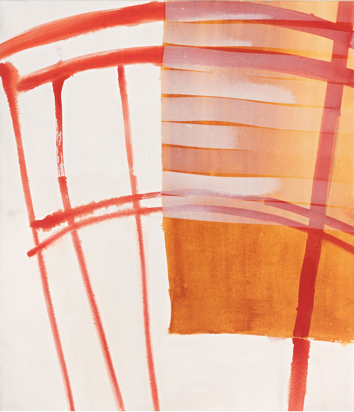
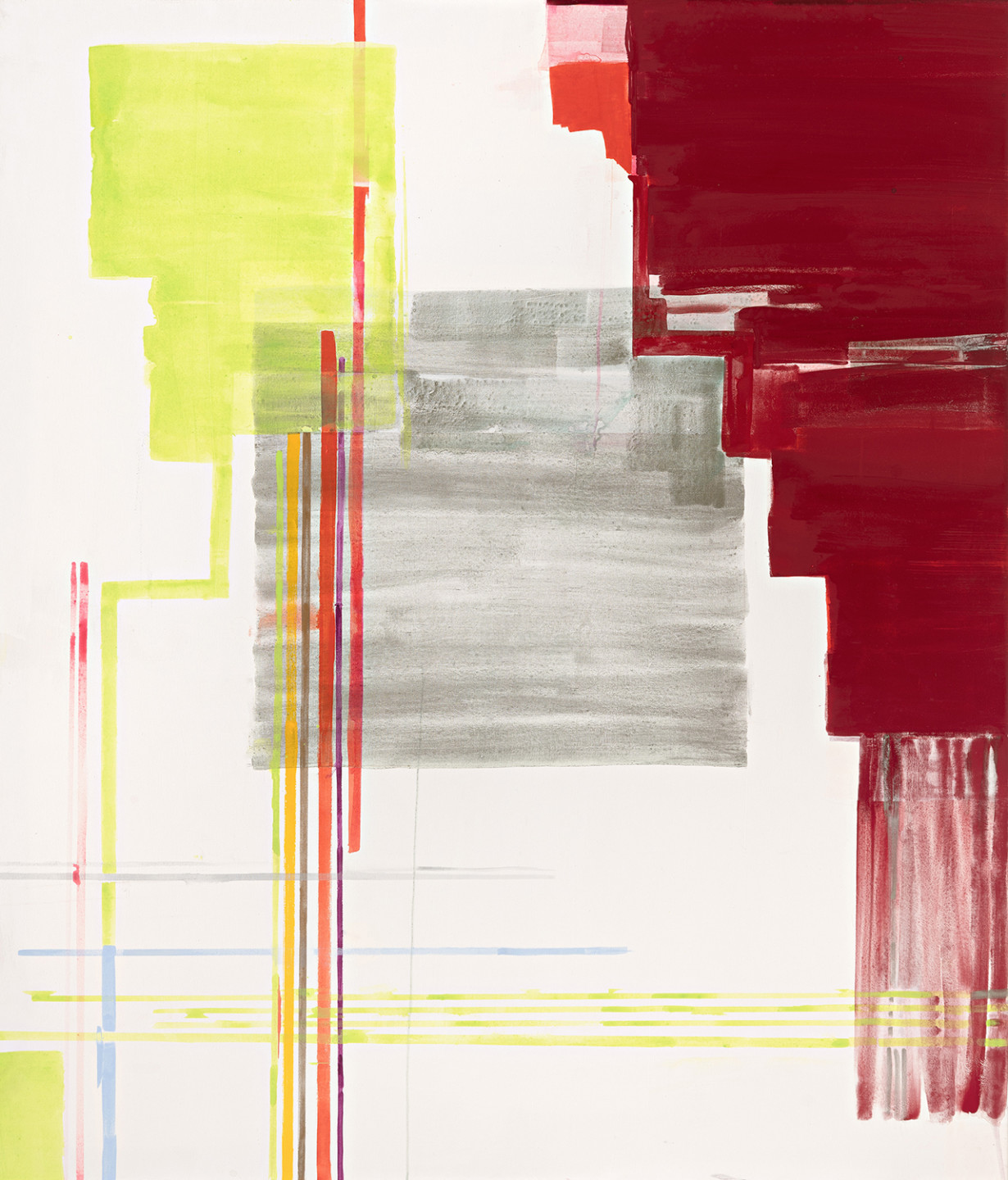
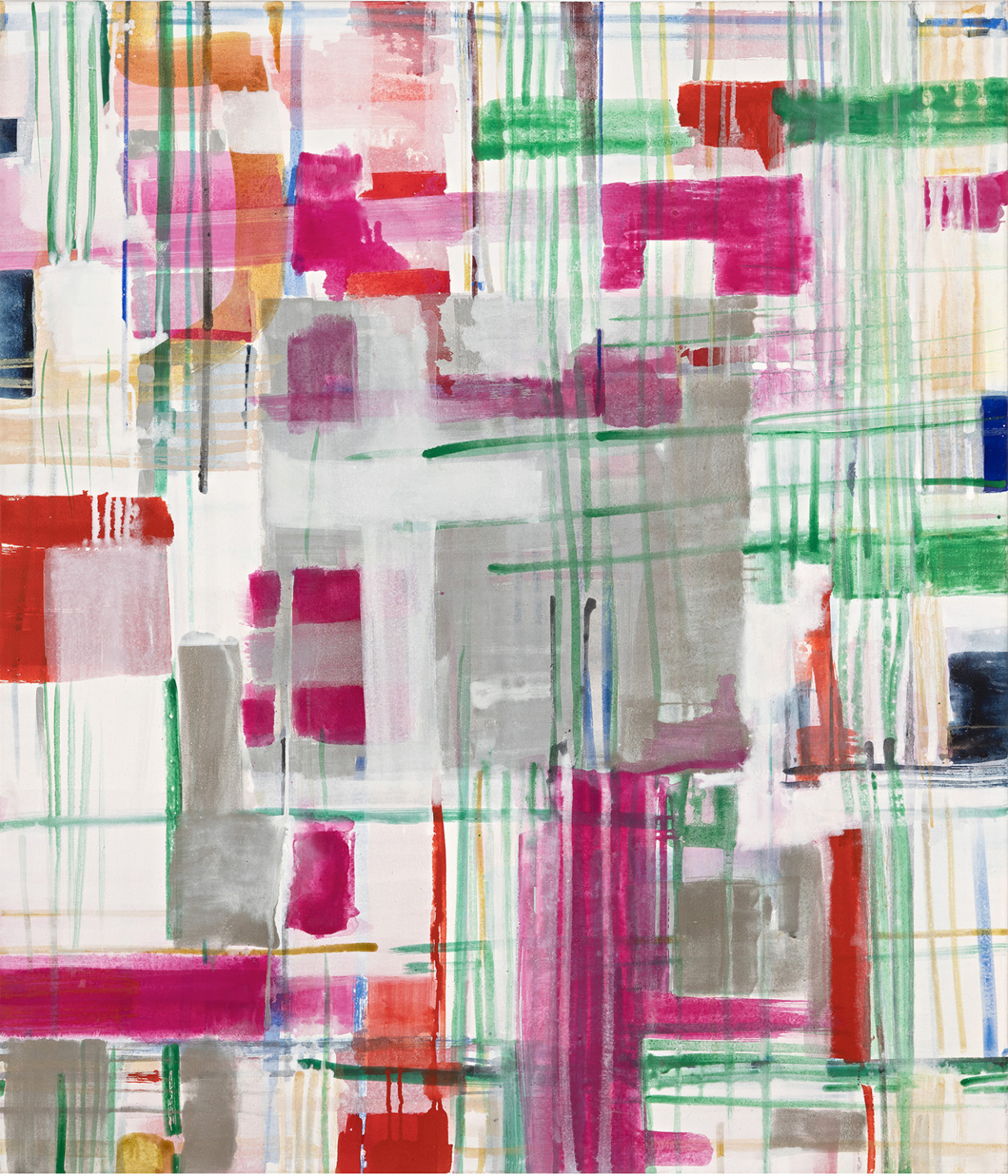
City plan of Ragusa (Stadtplan von Ragusa, 2003)
The paintings let the light in, and nothing seems permanent. They almost flicker and vibrate. The opposition of materiality and immateriality gradually dissolves in these magnificent works.
Between 2003 and 2009, inspired by her sojourns in Sicily, she painted works such as City plan of Ragusa (Stadtplan von Ragusa), a work in a series of street grid pictures from cities on the island in southern Italy. Again, the everyday life provides the starting point for a dazzling painting that forms a tapestry of horizontal and vertical lines. In Wassermann’s works, there is always a link to reality that is then transcended.
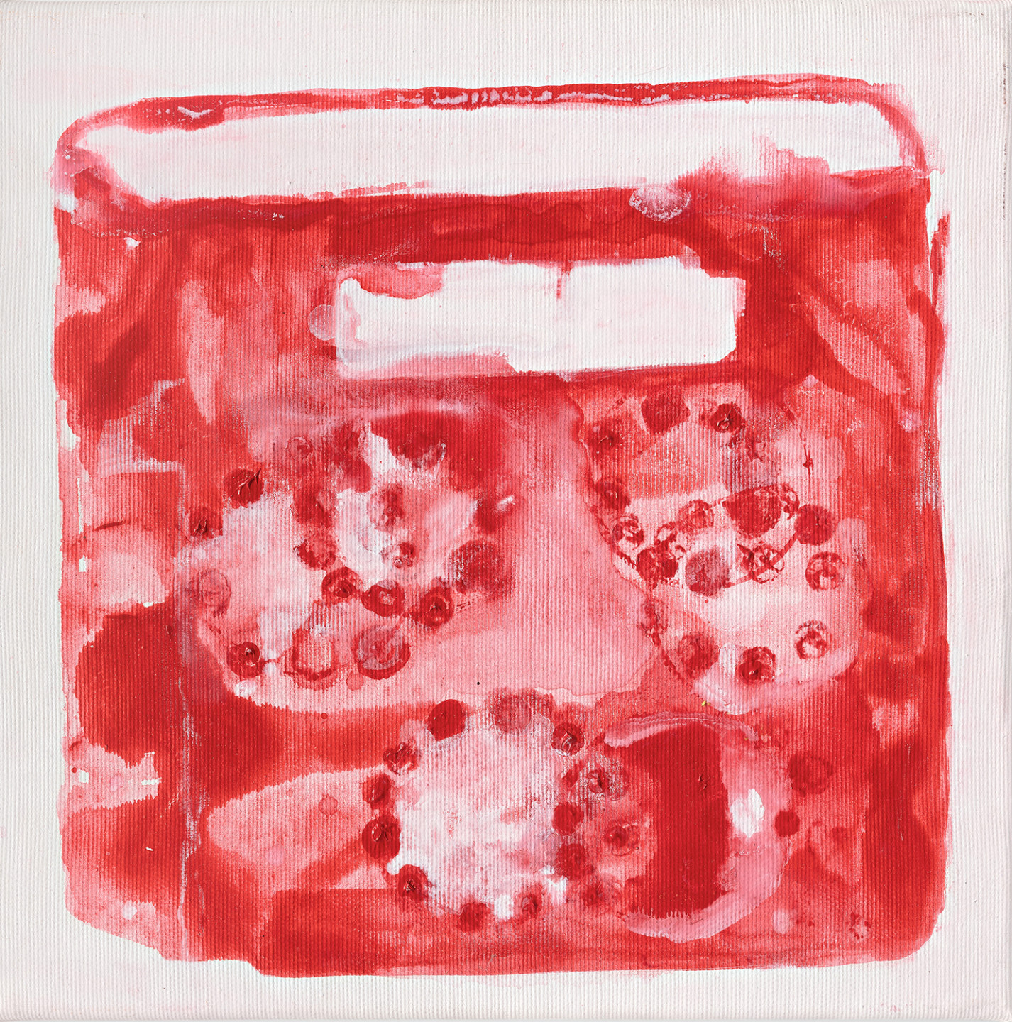
#186 (2005)
Here Beate Wassermann experiments with simplified shapes in small formats. In the large watercolours, again, the simplified forms have an almost calligraphic quality. A series of paintings of handbags reuses a theme that Wasserman was interested in back in the 1980s. The shape is identifiable in some of them, while in others the bags merely inspire painterly playfulness.
…So Far Away… (…So fern… 2017)
Fascinated and inspired by repeated travels to India from 2009 and onwards, Wassermann made these late paintings. Here, the artist returned to a silver square in the middle of the painting, with lighter and darker forms and colours sparsely applied in the foreground, sparking an intricate play of colour and form. The impression varies depending on what the eye focuses on.
The work …So Far Away… (…So fern…) from 2017 is probably the artist’s last painting. It has an even greater airiness. The title also suggests that the image is based on memory and conveys a sense of longing. The artist was by then seriously ill and knew that everything would soon be far away.