Fifty Years of Painting
Born in 1937, Ed Ruscha has been based in Los Angeles for all his working life. He regards the city as ”the ultimate cardboard cut-out town, full of illusions”. This, combined with a lifelong interest in typography and print media and a relish for ”the raw power of things that make no sense”, have all impelled his work.
Although Ruscha’s oeuvre has been aligned with both pop art and conceptual art, and has certain affinities with Dada and surrealism, it does not fit comfortably into any particular style or movement.
According to Ruscha himself, he is ”a combination of an abstract artist and someone who deals with subject matter.”
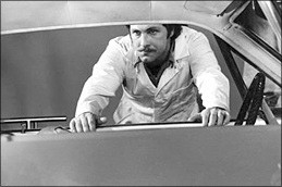
After graduating from high school, Ed Ruscha left Oklahoma City and drove to Los Angeles, over a thousand miles away. He enrolled at the Chouinard Art Institute to become a commercial artist, but also took classes in fine art. As a student, he worked part-time at the highly-regarded Plantin Press where he became interested in all aspects of book production and learned to set type by hand. He also began to do layouts for an advertising agency.
Painting classes at Chouinard were biased towards Abstract Expressionism. While Ruscha had great respect for this spontaneous, gestural style, he found that this approach went entirely against his instincts. Whereas Abstract Expressionist art was largely unpremeditated, Ruscha found that his own work ”had to be planned and preconceived, or rather wondered about, before being done.”
Early works
The earliest works in this exhibition – 1938 (1958) and the typographic self-portrait E. Ruscha (1959) – were painted at Chouinard. Though they reveal the influence of Abstract Expressionism in the handling of paint, both were carefully planned in advance, including the premeditated ”mistake” in the positioning of the ”HA” in ”RUS CHA” in the latter work. By the time he left college, Ruscha had discovered the work of Marcel Duchamp and the proto-Pop artists Jasper Johns and Robert Rauschenberg. His attention shifted from commercial art to painting, but he continued to maintain a keen interest in printing techniques and typography, feeling ”newspapers, magazines, books and words to be more meaningful than what some damn oil painter was doing”.
” I always looked at a word like it was a horizontal bunch of abstract shapes, which is really what it is.”
Visual noise
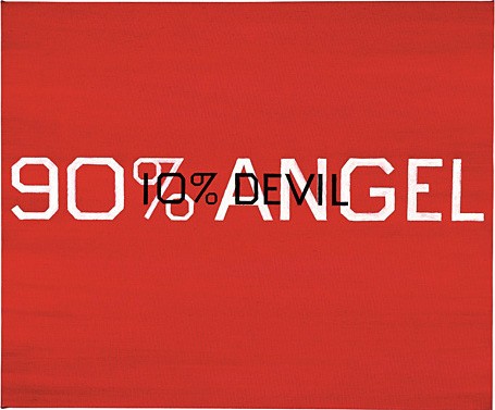
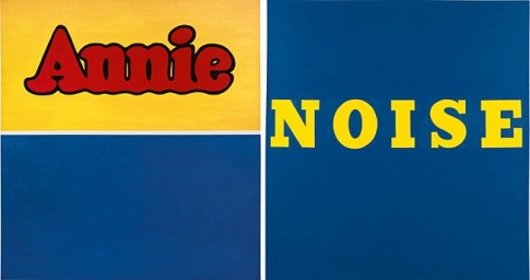
In the early 1960s, Ruscha began to make paintings featuring loud, punchy, monosyllabic words as Noise (1963). Treating words as objects, he viewed these pictures of lettering as a type of still-life, later reflecting that words have ”abstract shapes, they live in a world of no size,” and recalling that ”the visual noise of words crammed into commercial magazines and newspapers cried out to have art made of it. I just obliged.” Simultaneously, he was responding to contemporary life in a city reverberating with signs of every kind: ”the words I picked were pulled off the street, for their street power.”
Large Trademark with Eight Spotlights (1962) is the first in a series of horizontal canvases whose proportions echoed the wide-screen CinemaScope format introduced by Twentieth Century Fox. He saw the diagonal compositions in these paintings as ”a comic comment on the idea of speed and motion in a picture”, and remarked: ”I am always reminded of those scenes in the movies that I saw as a kid where there would be a train approaching that would suggest people travelling. The train would start at the lower right hand corner and then in two or three seconds it would zoom in and cover the entire area of the screen … The diagonal for me is like the zoom of a train.”
Playing with fire
In Norm’s, La Cienega, on Fire (1964), Burning Gas Station (1965-66), and Los Angeles County Museum of Art on Fire (1965-68), Ruscha brought flames into play, setting light to a diner, one in the Norm’s restaurant chain; a Standard Oil petrol station (which had already featured in other paintings and had become an icon of his own creation); and – most provocatively – to Los Angeles” newly-opened art museum. About this latter work, Ruscha commented laconically, ”I like the idea that this misfortune is happening in such a calm atmosphere.” But we might sense subconscious semantic meanings: Is it a standardized station or a station which dispense standards, like a restaurant which serves norms, or a museum which do both?
At the same time, Ruscha was also inflicting pictorial violence on words in Securing the Last Letter (1964) and Hurting the Word Radio #2 (1964), with Trompe l’oeil clamps and stretched and compressed letter forms. In the ”liquid word” paintings such as Oily (1967), with its glistening, poured and spattered lettering, Ruscha was looking for ”an alternative from the rigid, hard-edge painting of words that had to respect some typographical design.” Wordless paintings such as Glass of Milk, Falling (1967) and Ball Bearing Breaking a Glass of Milk (1967), segued into works in which pills, olives, marbles – small objects, painted actual size – appear like celestial bodies floating in deep space. The planetary analogy becomes even stronger in Large and Small Balls (1972).
Stains
Ruscha began experimenting with organic substances – household products, food and drink, and body fluids – instead of conventional artist media. He was making very few paintings and then for a whole year he made none at all. ”I can’t bring myself to put paint on canvas; I find no message there anymore,” he confessed in 1970. He resolved this problem by staining the canvas, rather than applying a ”skin” of paint to the surface. For It’s Only Vanishing Cream (1973) and Sand in the Vaseline (1974) he used satin and moiré instead of canvas, since they were more stain-absorbent. At this time, Ruscha also began to use phrases rather than single words. Meanwhile, he had also returned to painting with brushes and oil paints.
”Single words kept my interest for a while and then, later, there was only one thing to do – heap more words in.”
Words as landscape
With The Back of Hollywood (1977), Ruscha began a series of ”grand horizontal” paintings in which words and phrases appear against Technicolor sunsets. Ruscha has often referred to his word paintings as ”landscapes”, and here the description is literal. In A Particular Kind of Heaven (1983), or Friction and Wear (1983), however, where phrases float against the firmament, the words themselves become the landscape. The generic twilight skies and sunsets – as clichéd as movie backdrops or billboard advertisements – are simply supporting acts in the verbal drama. As Ruscha points out, ”words are pattern-like, and in their horizontality they answer my investigation into landscape. They’re almost not words – they’re objects that become words.”
”I’ve been influenced by the movies, particularly the panoramic-ness of the wide screen.”
Asked about the origin of the words and phrases he uses in his paintings, Ruscha responded: ”I might be driving, looking, listening to the radio, seeing things in advertisements, billboards, reading newspapers … occasionally something in a movie inspires me; any snippet of life where I hear something that causes a reaction. That’s where it starts.” He went on to say, ”A word by itself can be relished for its own sake, but I also like combinations of them. Some of them come to me through random thoughts or dreams.”
From 1980, Ruscha started using a typeface of his own invention named ”Boy Scout Utility Modern”. As in the Hollywood sign, the curved letterforms are squared-off, rather as if fashioned by a carpenter. A little later, he began using the technique of reverse stencilling in which letters appear as white canvas, the gessoed ground having been masked off before the backdrop was painted.
” I’m into the iconography of the country – street stuff and word stuff and highways and ribbons of asphalt.”
City lights
The ”City Lights” paintings introduce a new approach to background, with grids of bright spots on dark grounds that appear to be aerial views of the city at night. The grids are used as backgrounds for comically perplexing phrases and gnomic, handwritten jottings.
Olds appears to be illuminated by a headlamp. Besides evoking cinema – in alluding to the beams of light featured in Large Trademark with Eight Spotlights and to the light of a film projector – it is indicative of Ruscha’s love of cars and car culture. ”I see the automobile as part of the fabric of everything I know about,” he has said.
Paintings without words
In 1986, Ruscha began a series of wordless, ”strokeless” silhouette paintings, for which – against his own principles – he used a spray gun and acrylic paint in place of brushes and oils. ”I’m doing this because I’m tired of brushstrokes,” he remarked. ”I wanted something smoky and difficult to see.” Already in Cables / Fittings (1985), he had used sprayed black outline shapes and black horizontal bars in place of words. A blanked-out word, he felt, ”can suggest to you something like a censor’s strip. Or it can suggest the opposite. It can suggest a space for a thought …” But in monochrome silhouette paintings such as The Uncertain Trail (1986) and Strong, Healthy (1987), where the ”censor strips” are created by reverse stencilling, it was ”the bang of the black and white together” that most interested Ruscha. In Untitled (1986) and Howl (1986) – he was aiming for the immediately recognisable, at least to Americans who had seen the ”ancient image of a coyote howling” all their lives. At the same time, there is an underlying implied narrative. ”At one time I used to think that art was strictly visual, and you’re not supposed to go and dig deeper into messages. But now I believe it all has to do with tantalising your memory,” Ruscha said at this time. ”The most an artist can do is to start something and not give the whole story. That’s what makes mystery.”
Intimations of mortality
The movies have always played a large part in Ruscha’s art, whether in their signs and logos, visual and spoken language, or widescreen format. In the late 1980s and early ‘90s, he produced black-and-white paintings that refer in various ways to film. Besides suggesting the cinema-goer”s imminent return to the real world, Exit (1990) and The End (1991) also carry sombre intimations of mortality and decay. In The End, not only does the split-frame image with its Gothic lettering suggest that a vintage movie is juddering to a halt. The beautifully rendered celluloid is showing its age. It is both a celebration of, and lament for, old media in the face of universal digitalisation. A self-confessed technophobe, Ruscha admits to hating change and suggests that he first became attracted to painting because ”it was an almost obsolete, archaic form of communication.” He comments: ”I’ve been exposed all my life to movies in a state of deterioration. Now I’m painting scratches on the film. I think it’s beautiful the way film shows scratches.”
Light – celestial or earthly – pervades the numinous Hell Heaven (1988) and the shadowy Olds (1988-89). In the first, twin suns burn like arc lamps in an apocalyptic sky, backlighting a flagrant theological volte-face. (Ruscha, who acknowledges that his Catholic upbringing was ”an early childhood base” for a lot of his thinking, adds: ”I was a believer for a while and then I began to see the hypocrisy.”)
Mountains
Ruscha painted his first ”Mountain” picture in 1997. Explaining that these are invented or hybrid images and not pictures of actual peaks and ranges, he says: ”I am trying to capture the idea of the idea of the idea of the mountain.” As with the earlier clichéd sunset skies, this is an artificial, manufactured sublime. Long before he began the ”Mountain” paintings, Ruscha had said, presciently, ”a lot of my paintings are anonymous backdrops for the drama of words. In a way they’re words in front of the old Paramount mountain. … The backgrounds are of no particular character. They’re just meant to support the drama, like the “Hollywood” sign being held up by sticks.” With Me (1999) he focuses on a single word and, as in his earliest word paintings, its sense becomes more ambiguous the longer one looks at it. ”I’ve always liked the idea that if you stare at a word long enough it begins to lose its meaning,” he says. In other ”Mountain” paintings, sublime alpine ranges become backdrops for high-street brand names. Parking Picture (2000) lists a medley of shops and nightspots: ”It’s like a story of the city; I like the oddity of nature in the background,” Ruscha remarks.
Change and decay
Throughout his career, Ruscha’s method of working has involved what he calls ”waste retrieval”; a practice of ”taking things from my past and resurrecting them”. The paintings The Old Tech-Chem Building (2003) and The Old Trade School Building (2005) are new takes on older themes. Each is a re-imagining of a subject that he had painted a decade before: Blue Collar Tech Chem (1992) and Blue Collar Trade School (1992). Originally, these and other black-and-white ”Blue Collar” paintings were produced in response to Ruscha’s feelings about the industrial side of cities, and their architecture of uniform ”boxes with names on them”. Admitting that he dislikes change, Ruscha acknowledges that ”it’s part of my life and maybe I’m painting change. LA is not a storybook village. Its buildings and streets echo a kind of franchising society filtered out of the rest of America … I simply observe the cruelty of progress and make pictures of that.”
”My paintings … come out of an American sensibility, out of urban frustrations which are characteristic of where I live.”
Ruscha continues this line of speculation with the diptych Azteca / Azteca in Decline (2007). The original inspiration for Azteca was a painted concrete wall that he glimpsed from a car as he was driving out of Mexico City. This neighbourhood mural caught his eye because of the radiating lines that ”are almost like the spotlights that I’ve had in my work before.” Seeing in it symbols of Mexico’s ancient civilisation, Ruscha also noticed that ”there was a lot of rubble and garbage around it, the thing itself was deteriorating, and that kind of triggered a thought – to paint a more deteriorated version of it.” Azteca in Decline shows the same image crumpled and defeated; ironically, the only thing that seems permanent is the ghostly white graffiti, which remains the same although the background it was originally painted on has fallen away.
Looking back over his long career, Ruscha has said: ”Even though my work is figurative, I still feel like I learned it all from abstract art. I have pretty much been doing the same thing since I was 18 years old. I have taken little side trips with other forms of art. But I have always come back to these initial things that got me going. Maybe it is because I painted signs or worked for a printer and learned how to set type. It’s information-age art.”