Xu Bing, typO-Writing with Style © Xu Bing
The 1st at Moderna: typO-Writing with Style
Claude Closky, Xu Bing, Olaf Nicolai
1.5 2004 – 16.5 2004
Stockholm
The resulting works are more about process than about fnite ideas, more about creating situations and experiences and challenging notions of power and its structures. Typography and its inherent powers has been a recurrent theme within the arts where typography repeatedly has been used as a means of expression. More recently, think of the works by for example Ken Lum, Lawrence Wiener, Joseph Kosuth and Barbara Kruger. Typography has been a frontier between language and objects, between language and images. The introduction of digital typography opens up these frontiers, makes them less defned and increasingly open for discussion.
From its inception, typography has been a system that marks social differences. And by the written word’s early enforcement of cultural standardizations, we are able to trace a more recent history of typography which worked to establish not only national identities, but that was designed as a visual equivalent of speaking with an accent. In many regards typography can be read as a form of cultural shorthand.
Much like the time between the 1880s and 1920s, when urbanisation and mass emigration brought together languages and dialects previously separated by geographical and social space, the World Wide Web is now facilitating a similar phenomenon in a digital environment. This extensive web, distributing the written word in most global languages, has come to challenge previous notions of font design and its capacity as visual communicator. The introduction of cross-platform ‘device independent’ software in the mid 1980s, adds dimensions to the situation. For the designer, switching from one language to another became a fairly effortless matter. Cyrillic, East-European, Latin, Greek and additional characters could exist within the same digital fle, something which had not been possible since the moveable metal type.
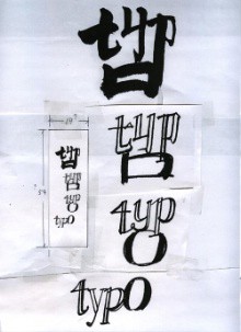
Xu Bing works with ideas informed by Chinese calligraphy. Realised as part of his large-scale installations, Xu Bing has run calligraphy classes in museums practically all over the world. Himself an immigrant to the United States in the early 1990s, the font on display in the typO exhibition is something of a hybrid based on Chinese calligraphy. Playing with Western notions of what is “Chinese” and “exotic”, the signs that appear on the screen when we write on a standard Western keyboard are the artist’s own personal memories of Chinese calligraphy, something which he himself does not master.
Claude Closky has developed a series of fonts named after ski resorts, making subtle visual hints towards the act of skiing. Separated from the ski theme is his Aspen font which is a collection of found symbols and logos here assembled to make up the alphabet. Here Closky has reversed the corporate practice of having a font substitute a logo and instead uses logos as individual signs. The resulting effect is that Aspen writes as a long string of commercial associations.
Olaf Nicolai’s font displays chunky building blocks in various colours and sizes. In the beginning challenging and hard to decipher, it is the design that stops us in the act of immediate and fluid reading. This delay causes the viewer to reflect upon our way of reading which otherwise is all about capacity to read symbols and immediately gage their value as well as status.
As part of the exhibition, visitors are also invited to create their own typographic signs with the help of the software “LetterFormer”. This was originally developed for an online collaborative typography project called “Chinese Whispers” www.beaufonts.com/pssst/. The challenge lies in creating ways of communicating with words and symbols. The software has been developed by Ian Mitchell in the Department of Graphic Arts at John Moore’s University in Liverpool.
Curator: Cecilia Andersson
The 1st at Moderna is an exhibition programme for contemporary art. The opening is always on the first day of the month, and the exhibitions are in different venues in or outside the museum.