Louise Bourgeois, Quilting, 1999 © The Easton Foundation Bildupphovsrätt 2019
Artists presentations
Torsten Andersson
Sweden
Torsten Andersson (1926-2009) had his breakthrough in the 1950s with a series of noted exhibitions in Stockholm and biennials in São Paulo and Venice. In the 1960s he established himself as one of the most interesting painters in Sweden. His goal was to reconquer easel painting, and he dedicated his career to an exploration of painting’s possibilities. Andersson became an instructor at the Royal Institute of Art in Stockholm in 1960, but in 1966 he abandoned big-city life to return to his roots in Hörby, a village in Scania County, and to take a break from painting.
In 1972 Torsten Andersson took up painting again in a quest for an elusive painterly idiom that would define him as a person. He began making abstract portraits of imaginary sculptures, beginning with a suite of paintings called Fabric Sculptures, which he compared to mattresses. His next series of fabric sculptures had patterns of marks, which later transformed into the pencil marks that are visible in the painting Stick Sculpture, featured in this exhibition. Andersson asserted that the stick sculptures evolved from the fabric sculptures, their sculptural mass disappearing to be replaced by patterns that here become three-dimensional because of the marks drawn down the middle of each brushstroke.
The artist’s relentless search for a specific, painterly idiom of his own evolved still further with the diptychs Personality as Person and Personality as Language. The painting on view in the exhibition is from Personality as Language. Torsten Andersson ultimately came to the conclusion that a melding of language and person was not possible—that painting alone could not define him as a person.
Work in the exhibition:
Stick Sculpture: Personality as Language, 2005
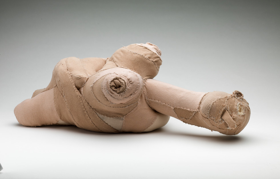
Louise Bourgeois
France/USA
Louise Bourgeois (1911–2010) is considered one of the most influential artists of the twentieth century, and she experimented with various materials and techniques for seven decades. Her original and multifaceted art encompasses sculptures, works on paper, and textile works. Bourgeois’s art is complex, radical, and sometimes even frighteningly direct when she gives form to intense emotions and experiences. She was a pioneer in several ways, not least as a feminist artist, and once said, “Throughout my life as a sculptor I have striven to transform women from objects into active subjects.” Her breakthrough came late, with a retrospective exhibition at MoMA in New York in 1982. She was seventy-one years old at the time.
In the mid-1940s Louise Bourgeois began carving totem-like standing figures out of balsa and redwood, often painting them in a single color, usually white. These sculptures took inspiration from sources such as surrealism and primitivism, and she referred to them as “personages.” She said they recalled memories of friends and family she had left behind in France and was missing in her new home in the United States, where she had moved in 1938. At first Bourgeois placed her “personages” directly on the floor, but later set them on a base, as we see in Moderna Museet’s sculpture Pillar. Later she also made bronze castings of many of them. The work in Moderna Museet’s collection, however, is a one-off carved in wood from 1949.
The hanging bronze sculpture Janus Fleuri is one of Louise Bourgeois’s most iconic works, and she has referred to it as a self-portrait. In all its ambiguity and ambivalence, this work is a metaphor for sexuality, and for man’s underlying driving force. During the 1960s, Bourgeois’s work addressed the issues of gender assignment and identification that became central for younger generations of artists during the 70s and 80s.
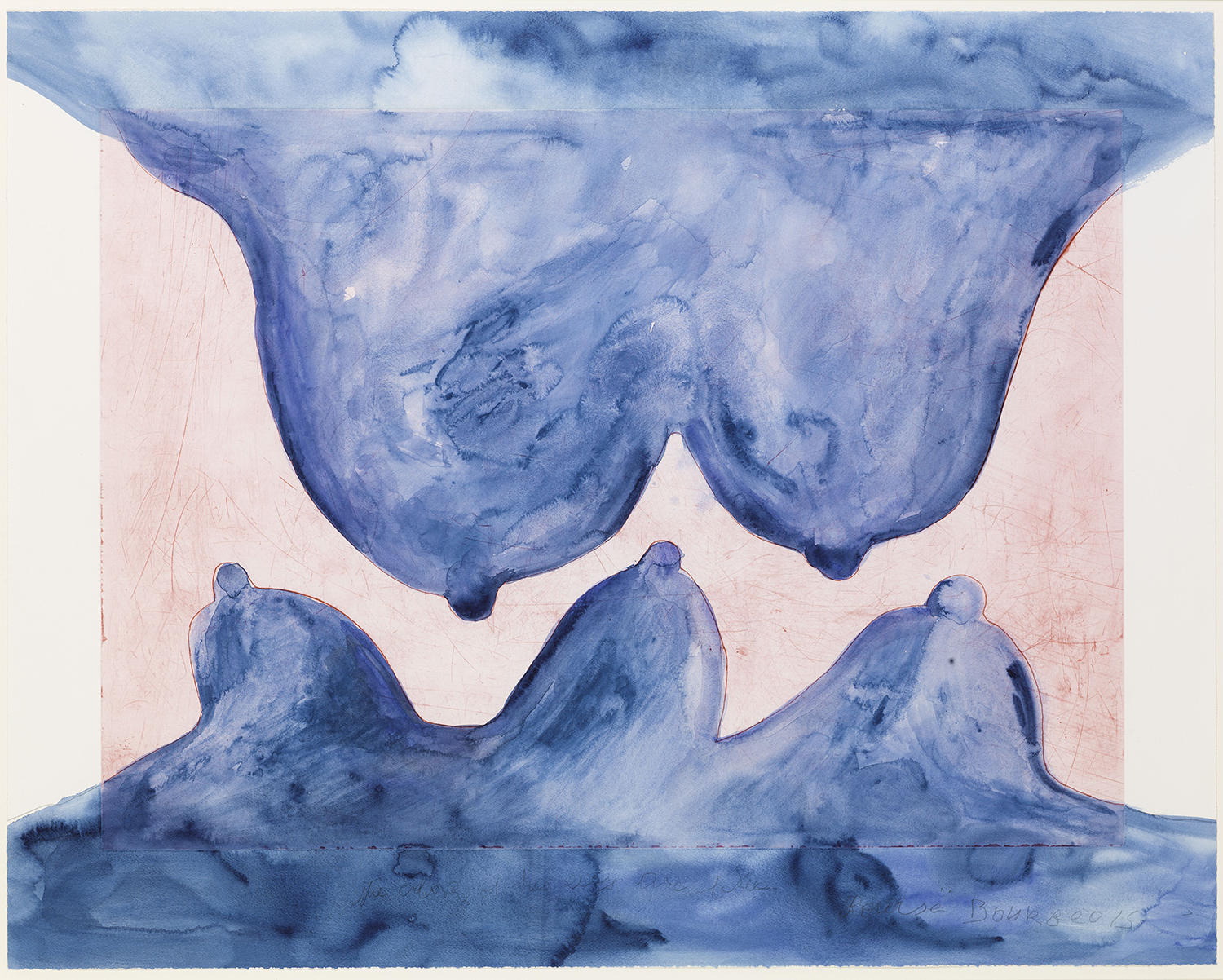
Textiles and their restoration was a part of Louise Bourgeois’s life from the time she was a child. She grew up in a middle-class Parisian family that made its living by restoring tapestries from the Middle Ages and the Renaissance. Sewing and repairing became an important aspect of her practice as an artist, which we can see in her sculpture Quilting. In the work I Am Afraid, the artist conducts an internal dialogue about her various fears and comes to the conclusion that while she may not be complete, neither is she actually lacking anything. Here the lines of text are woven into the fabric to become a part of the weaving rather than embroidered onto a fabric base.
For Louise Bourgeois, life and art were inseparable. Memory played a major role in her creative process, and she spoke about her art as a confrontation with the past in order to achieve self-awareness in the present.
Works in the exhibition:
Pillar, 1949
Janus Fleuri, 1968
Quilting, 1999
Blue Is the Color of Your Eyes, 2008
I Am Afraid, 2009
Nina Canell
Sweden
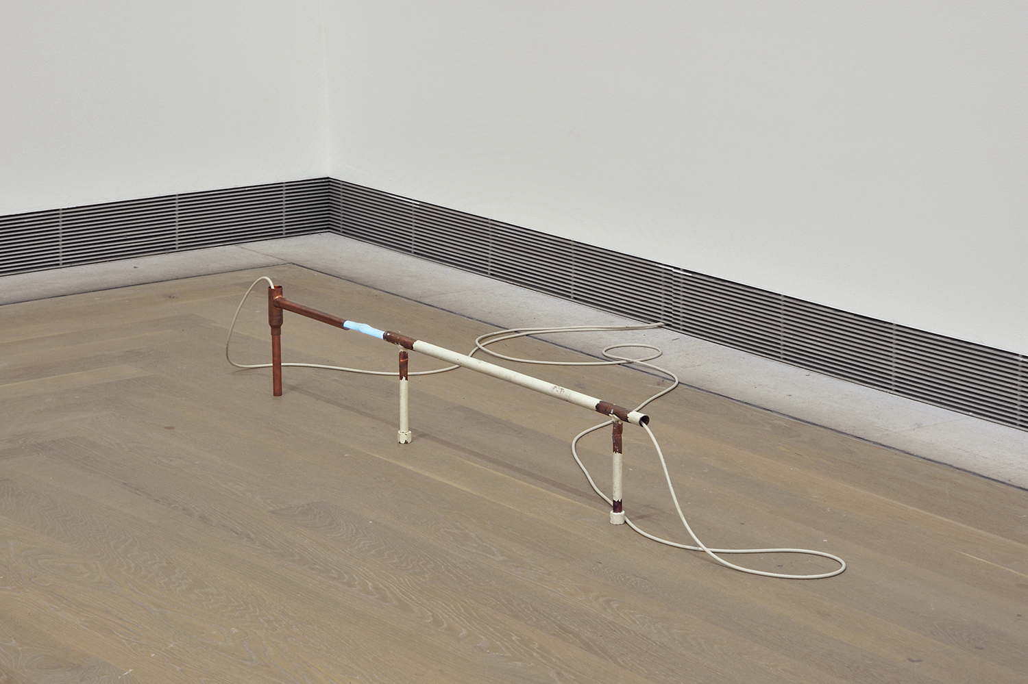
Nina Canell’s (b. 1979) sculptural idiom is subtle and poetic, her work usually made from the kinds of everyday materials we often use but rarely see. Her understanding of sculpture is expanded and reflected in her relentless examination of simple materials such as power cords, seeds, and glass vases. She is also interested in immaterial phenomena such as air, sound, light, steam, and electromagnetism, and in the relationship between these and people.
In the work Glances, electricity is perhaps the most important material, and Nina Canell has used electricity as a binding agent in several of her sculptures. The copper pipe transports electricity that is converted to light, a new material that changes our perception of the space occupied by the sculpture, both visually and auditorily. Canell is interested in the intersection between energy and object, and she asserts that it is that point in particular where questions are formed—questions about sculpture, material, and even the invisible forces that make everyday life possible.
Many of Nina Canell’s sculptures are objects that might catch our eye only momentarily, as a fluorescent tube would—things we might only “glance” at in passing because of the unassuming materials she uses.
Work in the exhibition:
Glances, 2014
Johanna Gustafsson Fürst
Sweden
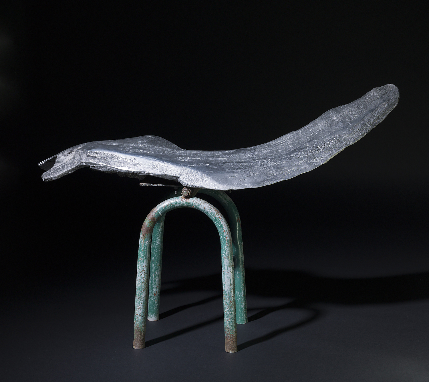
Public space is often the point of departure for Johanna Gustafsson Fürst’s (b. 1973) work as an artist—the various power structures that shape it and urban planning’s petty way of dictating our movements and our lives. Her work is therefore often described as social critical.
Several of Johanna Gustafsson Fürst’s sculptures make use of a particular dark green color that is encoded by the Natural Color System as S 8010-G10Y and known colloquially in Sweden as “public green.” It is the color used on park benches, light poles, waste cans, bike racks, and so forth with the intention of creating a calm urban environment, as in a forest. Public green characterizes urban life as a substitute for the natural world, and in the sculpture Win-Win the observer is confronted with an aluminum casting of a tree limb perched on the base of a discarded seesaw. Metal that looks like nature, nature that looks artificial: Gustafsson Fürst uses these dichotomies to reveal unnatural ideas or behaviors that have become normalized.
“Transparency,” “participatory decision-making,” “democratization,” and “win-win” are platitudes often used in commercial and pro-business contexts and discussions. Johanna Gustafsson Fürst finds it disturbing that these terms have crept into the language and have even begun to be used in everyday speech, and sees a need to turn the concept of “win-win” into an object so that it might no longer be trendy.
The expression “win-win” suggests a balance, but in this sculpture, everything is cast and fixed. It cannot move—it’s a make-believe balance, a non-negotiation. Johanna Gustafsson Fürst questions the whole concept of balance: it doesn’t really exist because one side always compromises more than the other.
Work in the exhibition: Win-Win, 2015
Sofia Hultén
Sweden
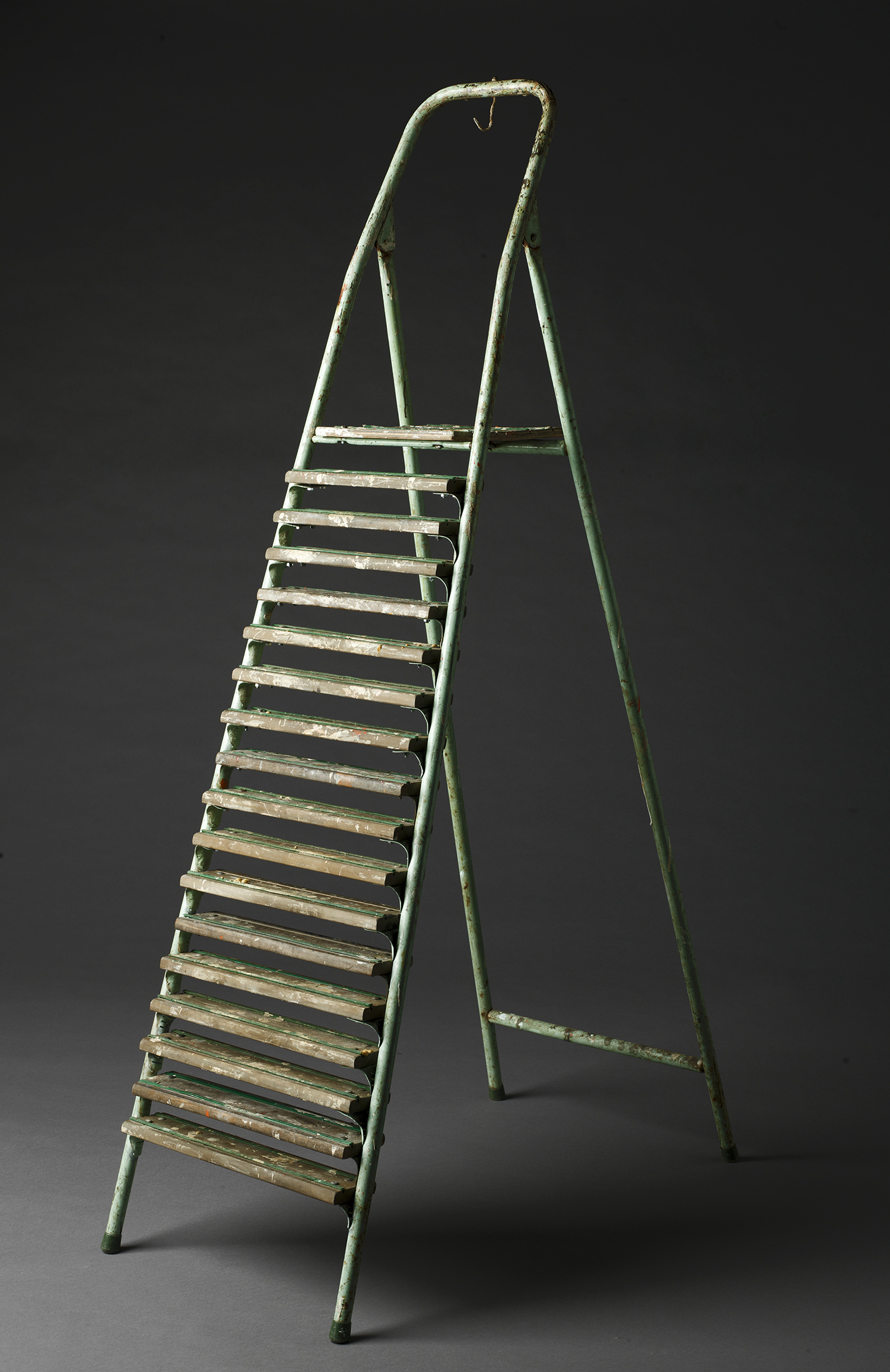
In her work, Sofia Hultén (b. 1972) speculates about the stories that might lie behind the objects she finds on the street and transforms into her sculptures. The encounter between artist and object becomes an essential material in her work, and the gallery label’s description of materials often takes the form of a story in its own right rather than merely a list of physical materials.
In the work In Between the Possibilities, Sofia Hultén has added thirteen steps to a found old stepladder. Although the addition makes it worthless as a ladder, the process of crafting it reveals the passage of time because it meticulously reflects the ladder’s original condition. It is not the old steps that are to be renovated and polished to match the new ones, but rather the other way around. Hultén has spoken of her interest in the idea that “something can be transformed radically—but undetectably to the eye.”
Repairing and destroying are recurring events in Sofia Hultén’s work as an artist. In the transformation from something functional to something worthless, from an object with a specific, everyday use to a sculpture that can only be looked at and experienced, our thoughts turn to art itself—its purpose and the work of making art. The result is both absurd and liberating.
Work in the exhibition: In Between the Possibilities, 2010
Axel Lieber
Germany
Geschlossene Gesellschaft (Closed Community) comprises four fabric sculptures that differ in form, size, and color. What they have in common is that each one is made from a pullover.
Sculptor Axel Lieber (b. 1960) often uses everyday objects such as packaging, furniture, and, as we see here, clothing, and explores their forms beyond the function for which they were originally created. He often manipulates the objects so that only the most essential remains.
The transformation these pullovers have gone through is that they have become four reclining, sitting, and standing individuals of widely differing character. With a bit of humor, the artist turns all the openings inside out, at the arm, the waist, and the cuff, and creates forms beyond what we expect to find in a pullover. Although no one is wearing the items, the form of each represents a different type of individual, all of which occupy space in the room. They are alike but, in many ways, very diverse, as any group of people would be.
Axel Lieber studied at the National Academy of Art in Düsseldorf between 1978 and 1984. He has held the position of professor there as well as at the Art Academy in Malmö, where he lived for many years. Lieber is one of the founding members of the artists’ collaborative inges idee, which was formed in 1992 and has led to several large sculpture projects for public spaces. Today he lives and works in both Stockholm and Berlin.
Work in the exhibition: Geschlossene Gesellschaft, 1990
Eva Löfdahl
Sweden
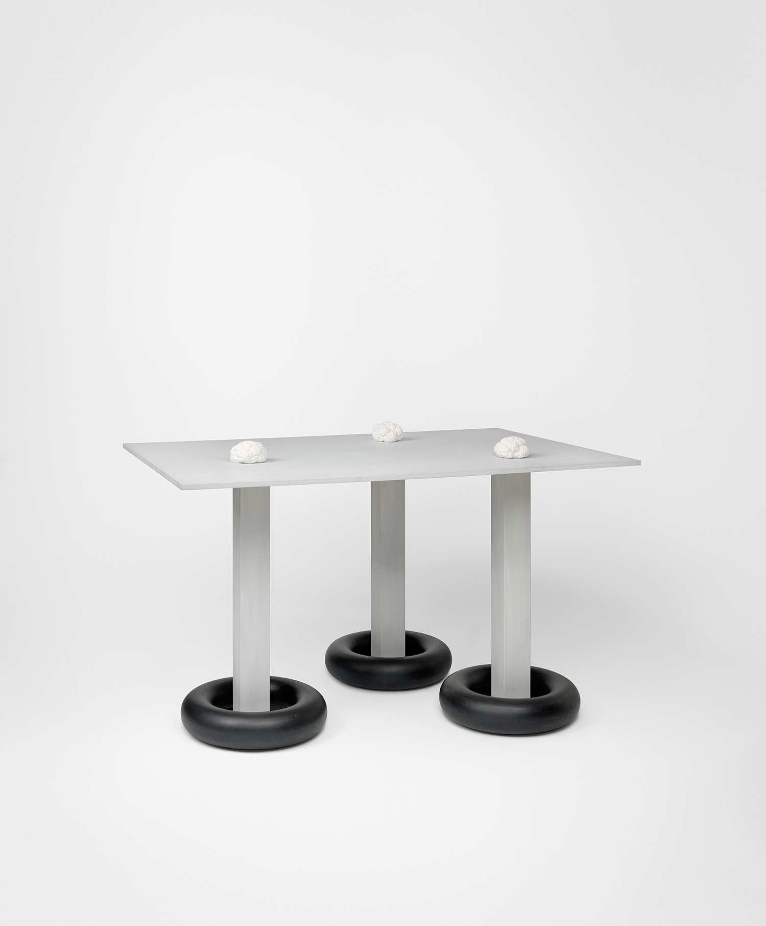
Characteristic for Eva Löfdahl’s (b. 1953) work is the skill with which she invites and facilitates interpretation in a way that is both amenable and opaque. It prods us for attention without being noisy.
In her sculpture Untitled we find an abstract and architectural idiom that encompasses both organic and industrial content. Castings of cauliflower heads, whose form can suggest the human brain, lie on a tabletop supported on three legs. Where these legs meet the floor, each foot is wrapped in forms that look like inner tubes for car tires. The table, or rather the idea of a table, is a recurring element in Eva Löfdahl’s work, and seems to function as both a supporting and a dividing force. She has the ability to capture the unfathomable in an idiom whose peculiar composition and combination of materials nevertheless seems self-evident.
Eva Löfdahl has been active on the art scene since 1980, when she made her debut as part of the Wallda Group, which also included Max Book and Stig Sjölund. She works in most media—including painting, sculpture, and installations— and has also created a large number of works of public art. Her first solo exhibition was in 1983 at Galleri Wallner in Malmö.
Work in the exhibition: Untitled, 1989
Mette Prawitz
Sweden
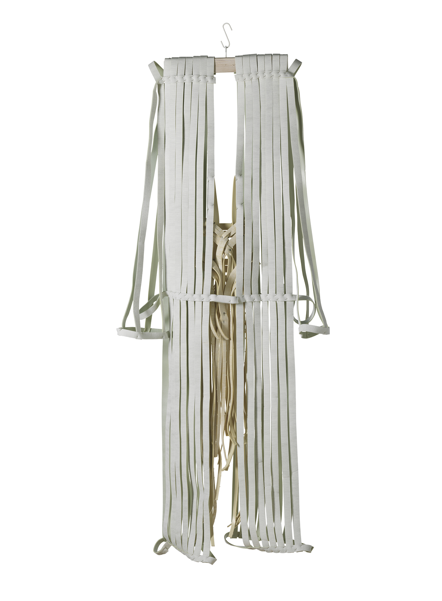
Mette Prawitz (b. 1934) produces ideologically based items of clothing that dissolve the boundaries between fashion and art. The point of departure for these creations is the human body, but they have at the same time a more sculptural expression. Prawitz had long been interested in clothing, but her encounter with modern art, such as that of Mondrian and Malevich, sparked ideas about how that interest might develop into something further. Russian constructivism had a particular influence on Prawitz, and she has often returned to geometric forms in her work.
The ideas behind the work Restraint, Expectant Men’s Suit came to Mette Prawitz during a fellowship in Berlin in 1989–90. It was a time full of change: the Berlin Wall fell and the notion of a new Europe began to take form. The work is part of a series entitled Garments in a Time of Expectation that includes both women’s and men’s clothing made from restraining belts. In an interview in early 2012, Prawitz said, “I’ve made all of them pregnant in the interest of equality. It was a time that reminds me of the longing for freedom we see sweeping through the world today with the Arab Spring.” With that in mind, her conceptual clothing sculptures should probably also be interpreted as wearable and timeless political manifestations.
Work in the exhibition: Restraint, Expectant Men’s Suit, 1994
R.H. Quaytman
USA
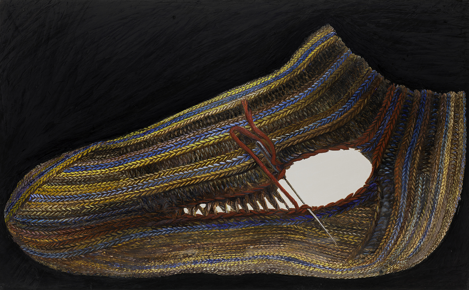
R.H. Quaytman’s (b. 1961) work O Tópico, Chapter 27 (Infante) is a highly detailed depiction of a knit sock against a jet-black background. Quaytman combines ancient painterly techniques with newer ones, and even with materials used in printmaking. The mixture of materials such as encaustic, gesso, and silkscreen ink requires a meticulous and delicate construction that results in a smooth surface on which the brushstrokes are barely detectable.
Since 2001, R.H. Quaytman has worked in chapter-numbered series of works. She doesn’t consider any of the individual paintings to be independent; each one always relates to the viewer, to the work on view next to it, and to the empty space between these. Each chapter includes both figurative pictures and abstract compositions, and each series of paintings is defined by a set of rules established by the artist that govern the format, material, and other attributes. These rules have emerged in part to confront what Quaytman considers the long and problematic tradition of painting in relation to, for example, power and economics. The rules give the artist room to create based on her own conditions.
R.H. Quaytman’s chapters are almost always tied to the place she has been invited to show her work next. O Tópico, Chapter 27 (Infante) was originally created for a large botanical garden and art park in Minas Gerais, Brazil. This is the first chapter she has made for a site outside of the United States or Europe, which gave her a heightened sense of being a foreigner or guest. Astounded by Brazil’s nature, Quaytman focuses here on the idea of matter and the substance itself—as she put it, “Matter as in earth, the thing itself, the subject.” In Portugese, O Tópico means “matter” or “subject”.
Work in the exhibition: O Tópico, Chapter 27 (Infante), 2014
Bella Rune
Sweden
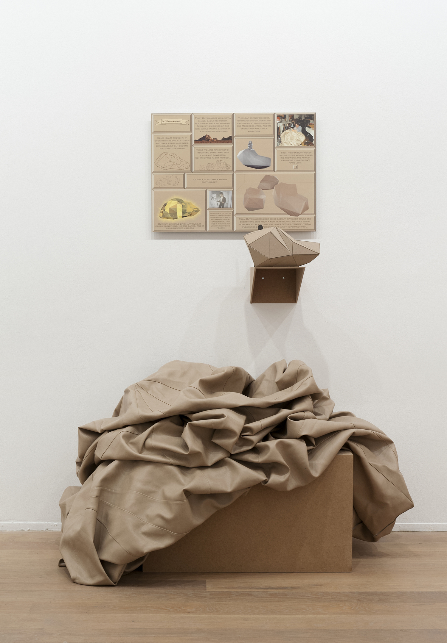
Bella Rune’s (b. 1971) sculptural works are often made from tactile materials in peculiar combinations. They might include fake fur, mirrors, fabric, and they might interact with augmented reality technology. Recently she has been allowing mohair yarn to occupy the gallery space and change the observer’s experience of the room.
With humor and a tactile sense, Bella Rune often creates large-scale objects whose size and placement force viewers to change the way they move both physically and mentally. In order to understand the story of Buttnugget, we have to lean over an empty inflatable vinyl fabric and read the tale of a little buttnugget. Rune has said that she “creates physical manifestations of human aspirations and hopes and the sorrowful and moving consequences of these crashes and shortages.” That description is borne out by the story and by the little figure hiding behind the sculpture.
Textiles are usually charged with codes that represent socioeconomic power: the rarer a fabric is, the more expensive it is. Synthetic materials such as vinyl are artificial and cheaper, but they aspire to be something more than they are—to give the impression of being authentic and valuable. The character in the Buttnugget story is just like the vinyl fabric used in place of leather to upholster the seating in a car.
Bella Rune is an artist and professor of fine art with an emphasis on textiles at Konstfack, the University College of Arts, Crafts and Design in Stockholm. She also works as a curator and researcher.
Work in the exhibition: Buttnugget, 1999
Amy Sillman
USA
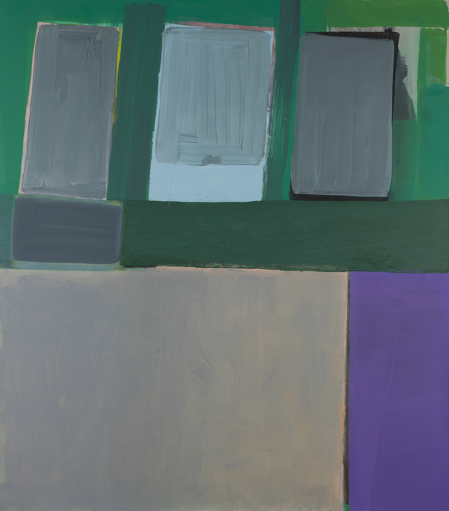
Amy Sillman’s (b. 1955) paintings oscillate between abstract and figurative, and she often fills her canvases with broad and bold brushstrokes. In one interview Sillman admitted that her greatest fear is that her work might be compared to abstract expressionism—a movement in art that emphasized a spontaneous and non-figurative style. A more correct interpretation is probably to see her work as in fact a critique of abstract expressionism and of the machismo-soaked discussion that has surrounded that movement and its tradition. Like many other women and queer artists, Sillman has conquered the physical, messy, and chromatic style. The bodily and physical aspect becomes particularly essential, and here it also becomes important to recognize Sillman’s attitude to form and content: they are inseparable.
The painting by Amy Sillman on view here in this exhibition is composed of a number of large, irregular color fields in tones of green, gray, and purple. The title, Sleepwalker, leads our thoughts in the direction of movement, the physical body, and the subconscious. The painting’s style suggests an intuitive working process that might also be seen, perhaps incorrectly, as lighthearted. Sillman has compared her own work to writing, compared her compositions with letters, noting how one form of work leads into the other. Any interpretation of her work should probably also be aware of the idea of resistance.
Since 2015, Amy Sillman has been a professor of painting at Städelschule in Frankfurt, and she also writes and lectures frequently.
Work in the exhibition: Sleepwalker, 2015
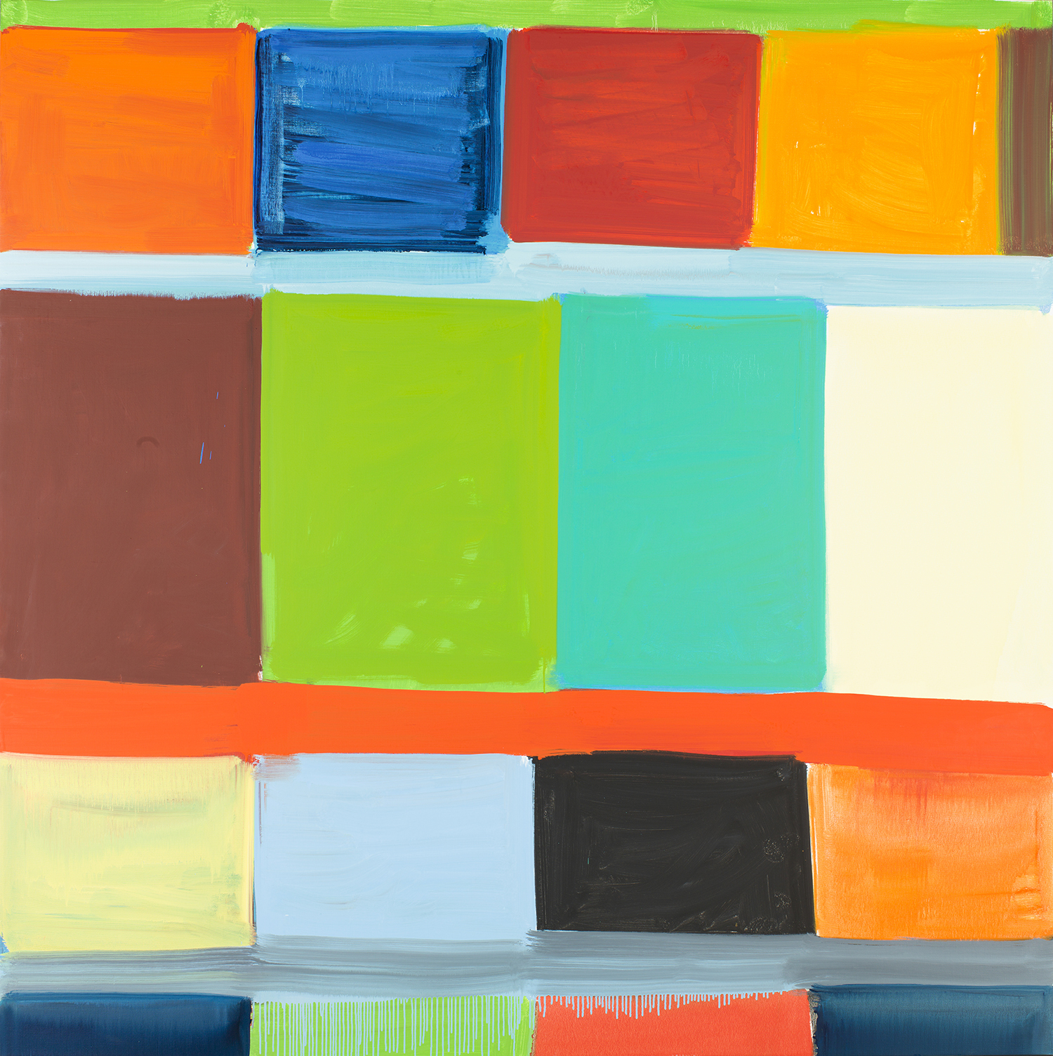
Stanley Whitney
USA
Stanley Whitney’s (b. 1946) paintings appear to be based on spontaneous gestures that continually repeat and never cease. They are often composed of a grid system built up of bold colors that fill out the canvas. And despite the abstract picture plane, there are often political undertones to Whitney’s work. The titles can serve as clues that point to several different ways of interpreting the pieces. Examples include Radical Openness and Unpronounceable Freedom. The painting on view here is entitled Off Square, which might seem to suggest skewing in relation to the grid composition—an uncontrolled system that is nevertheless constrained within the bounds of the canvas.
Stanley Whitney works methodically and rhythmically. He begins his square paintings in the upper left corner and finishes them in the lower right. In between he fills the canvases with colors that seem to take on their own internal relationships and personalities. Unlike most of the African American artists who were active in the late 1960s, Whitney never followed the common advice to paint figuratively in order to feature his experiences as a black man. “I knew I wasn’t a storyteller,” he has said. As a student he was instead inspired by abstract expressionism and minimalism. The inspiration for the grid pattern that now characterizes Whitney’s work came from an encounter with ancient architecture while traveling in Italy and Egypt during the early 1990s. Architecture led him onward in his work, and the irregular color fields we see in the paintings might be read as building blocks for something larger.
Work in the exhibition: Off Square, 2016