Willem de Rooij on Andy Warhol
Kasper König, who worked for the Moderna Museet as an intern of sorts in New York, developed a basic concept for the book. Reading Warhol’s work in the context of On Kawara and other conceptual contemporaries, König had produced a radical grid that consisted of four groups of images: one group documenting Warhol’s artworks, two groups documenting Warhol’s social and professional milieu, and one group documenting a selection of particularly outraged Warhol reviews clipped from provincial American newspapers.
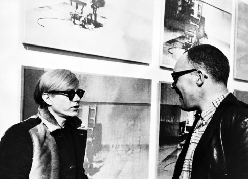
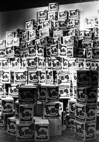
After Warhol had given his approval to this first proposal, König proceeded to create a dummy. Ivan Karp, who worked with Warhol’s dealer Leo Castelli, gave König access to their documentation archive. König produced a sequence of pages on the gallery’s Xerox machine that mimicked as well as documented Warhol’s work: many of the available images were photocopied by König several times, and ended up in the book as self-elaborations. Thus a repetitive structure was created that expands beyond Warhol’s (serial) artworks. Here is where the book started to become a piece (a multiple) rather than a catalogue, because the mode of production as well as the formal outcome mirrored procedures and politics that were at work at the Factory at the time. In the final version of the book, only Karp’s original documentation images are titled; König’s photocopies are not. Most of the works documented in this first image section were not shown in Stockholm; they merely served as source material.
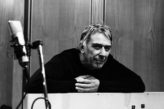
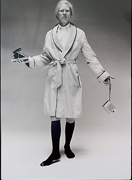
For the second and third sections of the book König commissioned Billy Name, chronicler and inhabitant of the Factory, and Stephen Eric Shore, a teenage Warhol groupie at the time. Both Name and Shore composed rhythms of their own sequences, and neither of them added any captions: they felt the images should speak for themselves. This absence of text contributed to the object-status of the book.
Name’s sequence consists of 274 images, each bleeding off an entire page. The sequence functions as a record of how Warhol and his collaborators lived, worked and celebrated, in- and outside the Factory. Most of the images have an informal character, like snapshots. Many are overexposed, unfocused or tilted, making for a visual dynamic that derails into a delirious storyboard. This series too, can be seen as an autonomous (time-based?) piece, more than a documentary exercise.
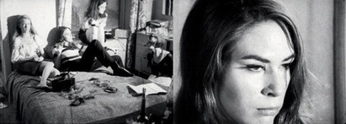
Shore’s sequence consists of 170 images, one per page. His images are more formal in their framing than Name’s. In comparison his approach seems detached, his images of the Factory uncharacteristically quiet and concentrated. Each image is reproduced in its entirety, the edges of the negative emphasized by white borders. Shore’s se-quence thus reads like an exhibition, not like a single piece.
When König returned his dummy to the Factory, Warhol scrutinized it carefully but made only a small number of changes. Contrary to what Warhol wanted to be popular belief, those who produced input at the Factory were carefully monitored.
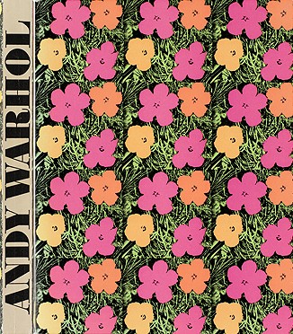
The final edits on the dummy were made in Stockholm by Olle Granath. He compiled a small selection of Warhol quotes and aphorisms from a stack of books and clippings collected by Hultén and placed them in the book as an introduction before the image sections. The graphic design was by John Melin and Gösta Svensson. Melin produced the typography in a style he had previously used for the Moderna Museet’s catalogues and posters. Because the idea was to print a large edition (eventually: 200.000), for a low price (eventually: $1), Andy Warhol was printed like a newspaper on the rotary presses of the Sydsvenska Dagbladets; an additional signed deluxe version with gilded fore-edge was produced in a small edition. The newsprint used was not only cheap, but also gave the book an ephemeral quality that appealed to the editors. All images are rendered in black-and-white, except the cover, on which a flower motif derived from Warhol’s paintings is printed in five colors. The envisaged press-clippings section had to be dropped: the book would have become too heavy to be efficiently stored at the distributors.
The exhibition in Stockholm attracted a relatively small number of visitors, due to the extremely cold winter, but also to the fact that leftist radicalization increasingly drove the Museets public to mistrust anything American or consumerist. There was no space yet for a more complex reading of Warhol’s relation to consumption. The book, however, became very popular: its enormous edition allowed it to be distributed in nightclubs and record stores, not only museums. A timeless update on the latest from New York, it first became a cult object, then a collector’s item.
Willem de Rooij on Andy Warhol
Text by Willem de Rooij from the exhibition catalogue. Written after telephone conversations with Kasper König and Olle Granath, 3 and 4 September 2007